


The contribution is hard to see
“Worked on testing” does not explain what was tested or what the person contributed. Useful writing starts with those missing details.
AI product designer · Designed and built with AI coding tools
I designed and built a resume tool that guides people from describing their work to checking, improving, and downloading a draft.
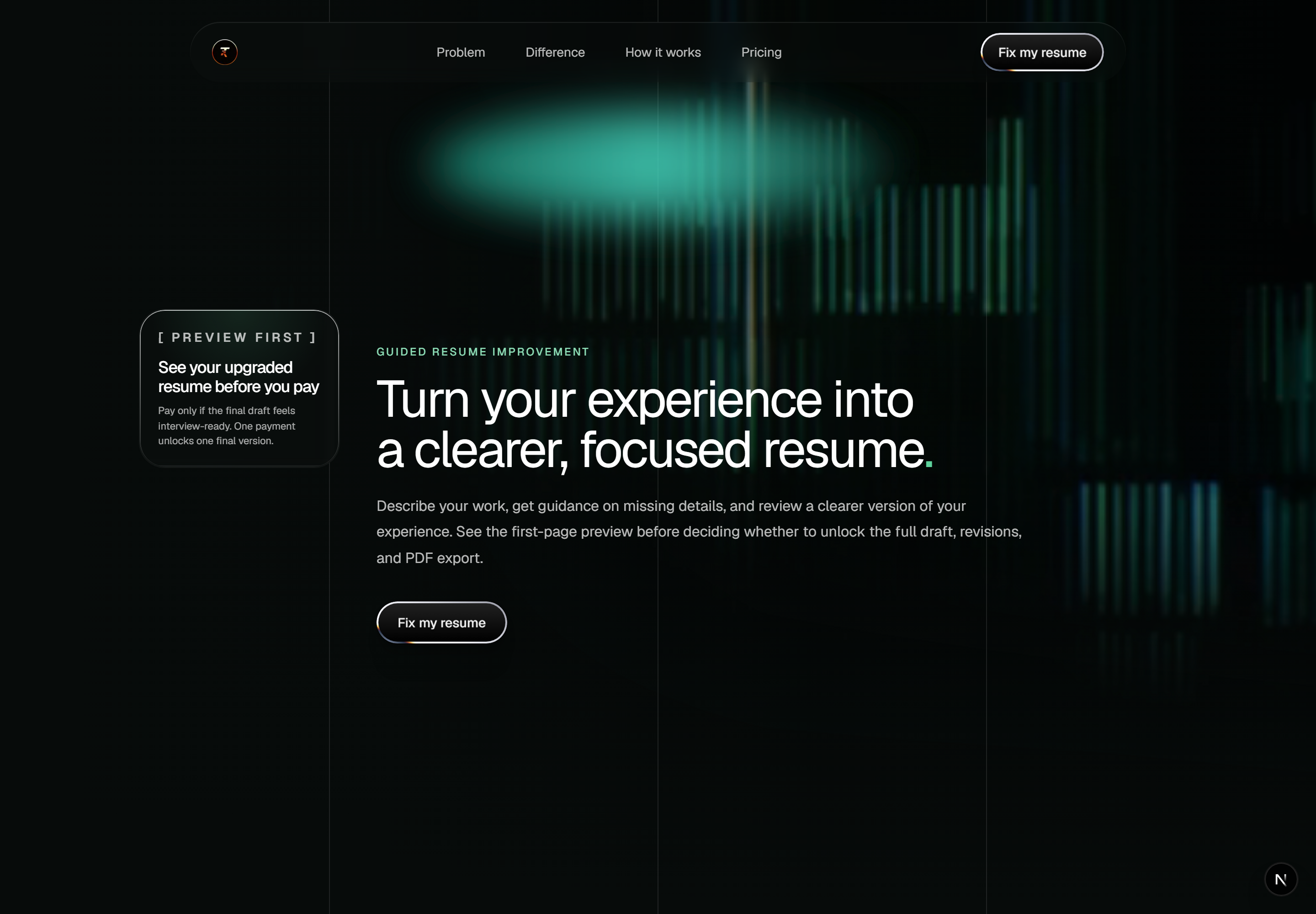
A resume needs more than polished wording. People need help choosing useful details, understanding the feedback, and deciding whether a draft is worth paying for. I designed and built that journey, from the homepage explanation to the builder, internal checks, draft access, and export. AI coding tools helped me implement the product decisions.
“Worked on testing” does not explain what was tested or what the person contributed. Useful writing starts with those missing details.
A number alone leaves people guessing. They need to know what it checks, which part of their resume needs attention, and what to do next.
People should understand the offer and see a useful preview before paying. They also need to know which draft and access they are buying.

I used a concrete writing example to explain the problem: name the work, scope, and contribution using facts the person supplied. A made-up percentage would add no value.
The homepage shows a vague statement beside a clearer version using supplied facts. “The difference” then explains what the person provides and where guidance, checks, and review help.
That gives the builder a purpose. Role, job context, and contribution questions ask for information that can make the resume more specific, while suggestions still need the person's confirmation.
The tradeoff. Structured input takes effort. I kept the job description optional and guidance close to the section it helps.
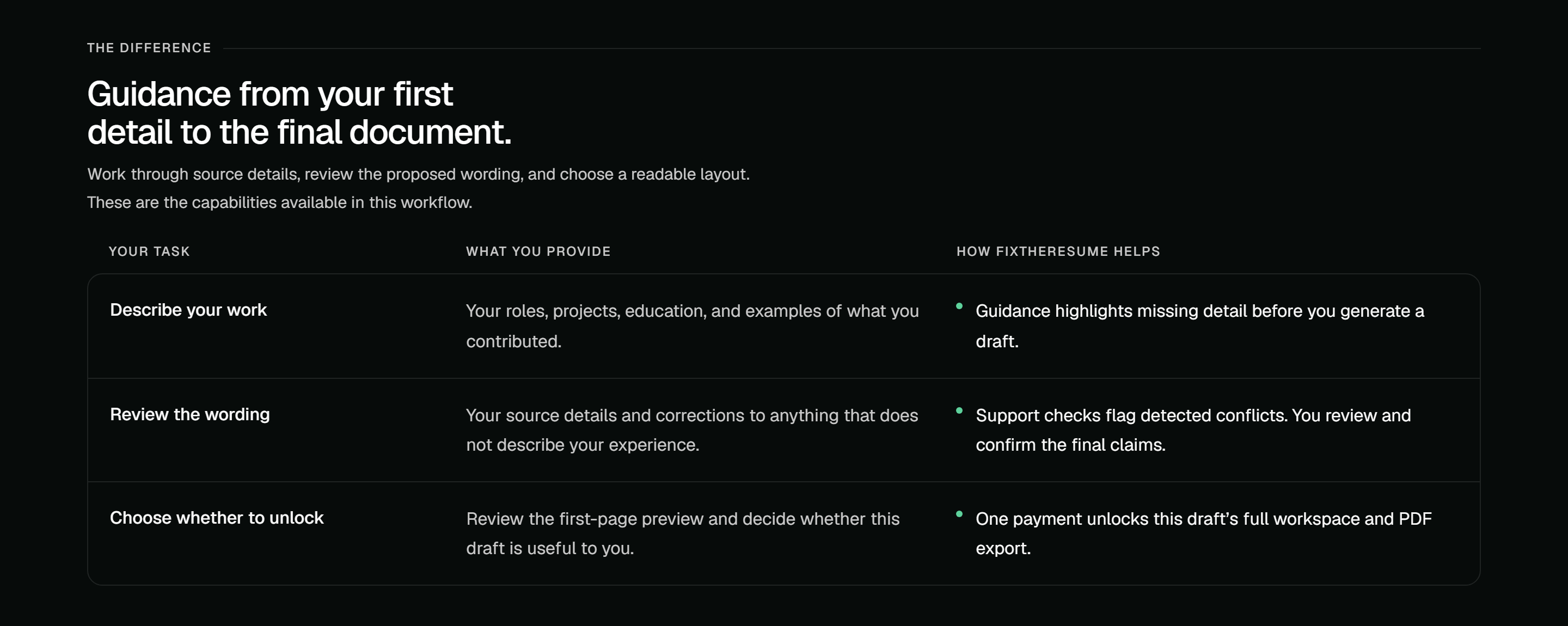
Swipe across to read the comparison.
The homepage sets clear responsibilities: the person supplies and confirms their experience; the product guides, checks, and presents it. That expectation carries into the builder.
The workspace separates document checks from writing checks and links bullets to supplied source details. The Refine tab ranks issues so people can apply or skip one at a time.
Feedback becomes something a person can inspect and act on. Missing job context is labelled, and the interface explains that its internal score is not an employer's ATS score or a hiring prediction.
The tradeoff. Support checks can flag conflicts, but they cannot independently verify someone's career. The person still reviews the final claims.
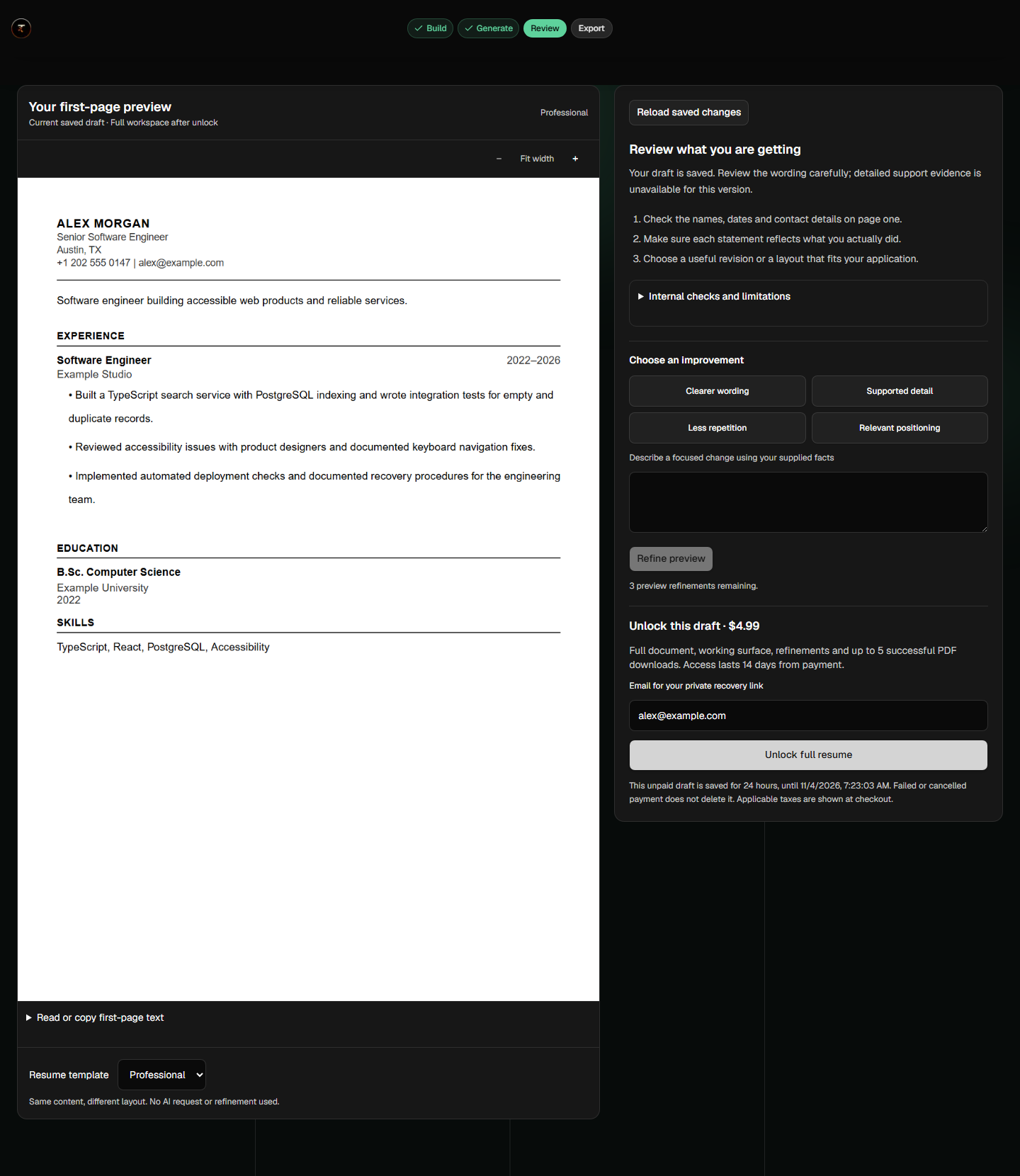
Homepage pricing explains a one-time unlock for one draft. The locked preview shows the first page, review prompts, and the access terms beside the unlock action.
I connected the business model to a clear user decision: inspect the result, understand what is included, then choose whether to pay. No account is needed to start.
The tradeoff. The preview must help people judge the result while making full-document access clear. I would test comprehension and paid unlocks together.

Pricing explains the exchange before the builder: review first, then pay once for one draft. The dated capture shows the quote, access window, and PDF allowance—not a subscription.
Builder input saves locally; the server owns the generated draft and paid access. Score, Refine, and Export share that draft instead of starting separate jobs.
This connects backend rules to the experience: refreshing should not lose paid access, and export failure should not revoke it. Success confirms a PDF export; email delivery has a separate status.
The tradeoff. Each recovery and access state needs testing. The supplied captures show a real local PDF export, but simulated payment and no live model revision.
Corrected default-UI captures from 3 November 2026. The resume is fictional, the preview was seeded, and payment was simulated. PDF export was exercised locally. Focused views link to the full captures.
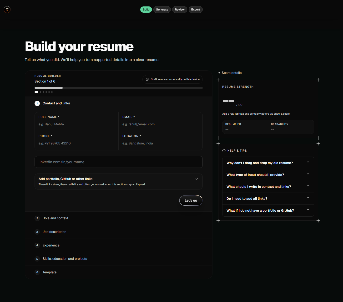
Contact details build the resume header. Six sections, saved progress, and nearby guidance show how to continue.
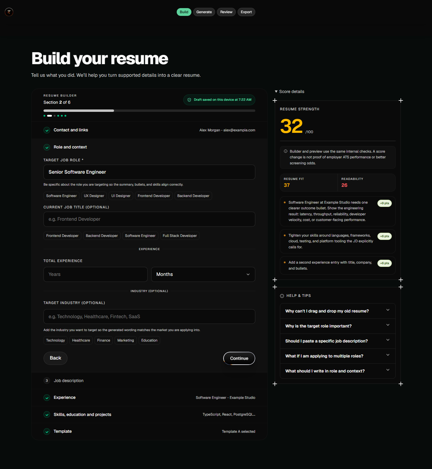
The target role guides the resume's focus. A job description can add context; when it is missing, the app does not pretend to assess job alignment.
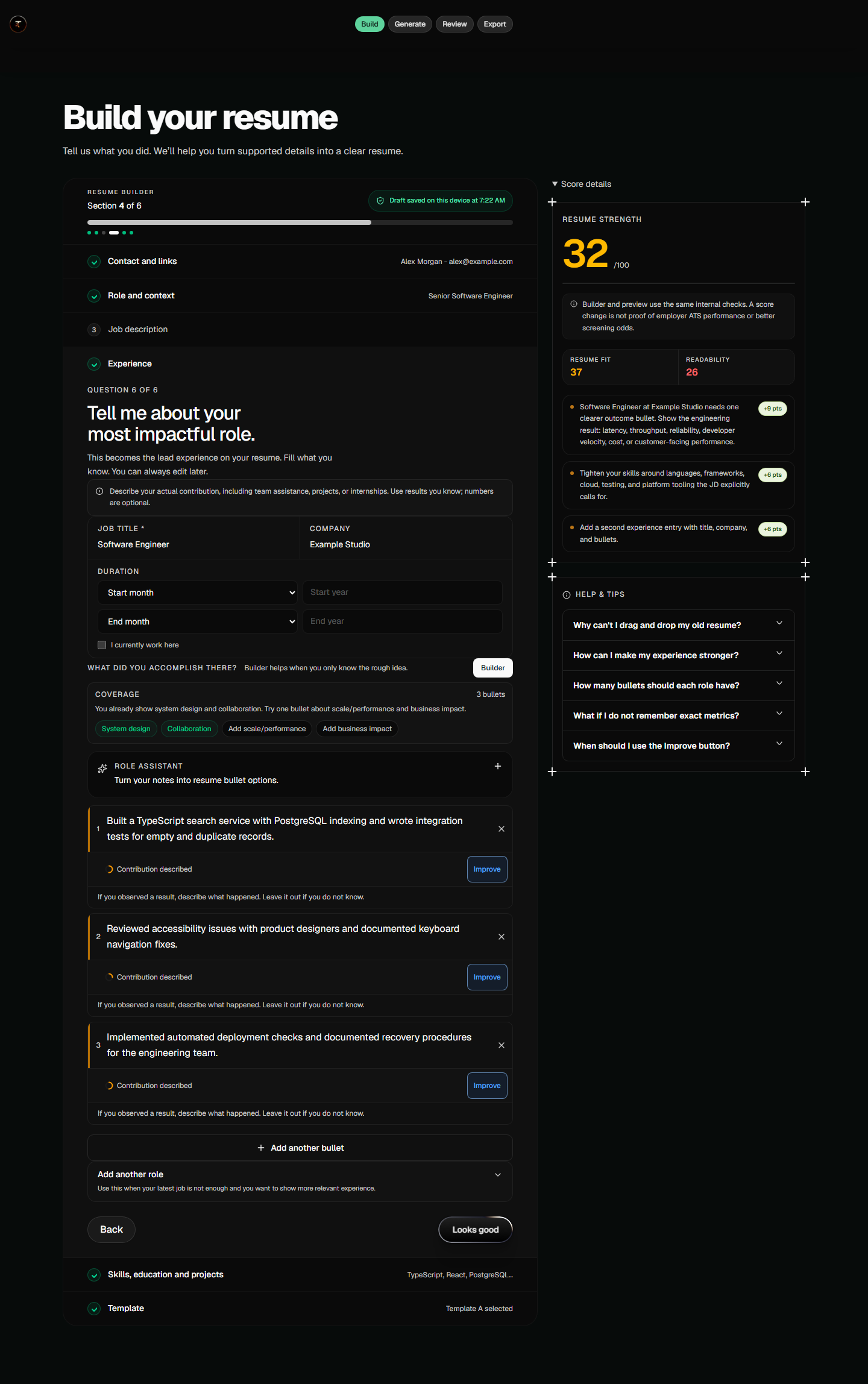
The sample names a search service, integration tests, and accessibility work. Prompts ask for known outcomes; the person does not need to invent a percentage.

The document sits beside review prompts and unlock terms. This seeded example asks the person to check the facts because detailed support evidence is unavailable for that draft version.
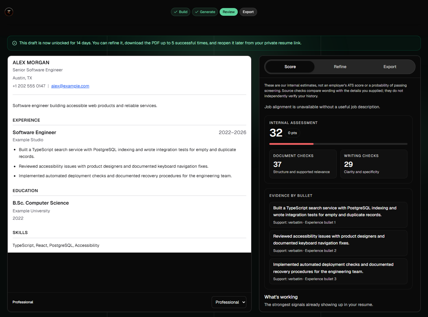
Document and writing checks explain the assessment. The evidence list points back to supplied bullets. These are internal estimates, not hiring odds.
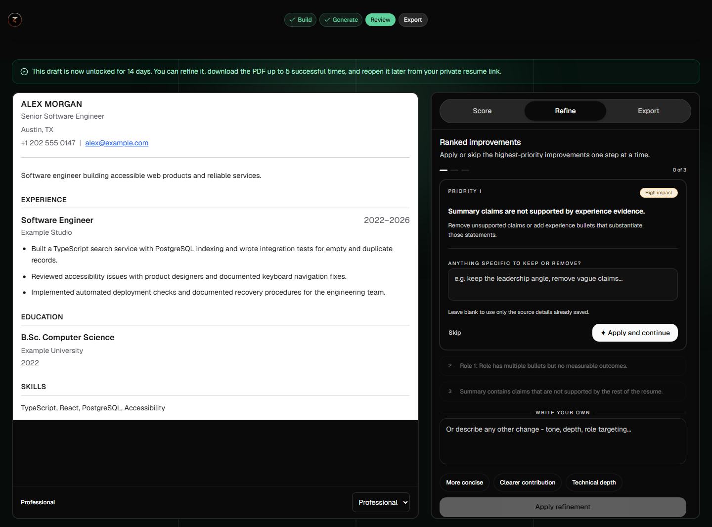
The Refine tab ranks suggestions and offers Apply and continue or Skip. This shows the review controls, not proof of a live AI improvement.
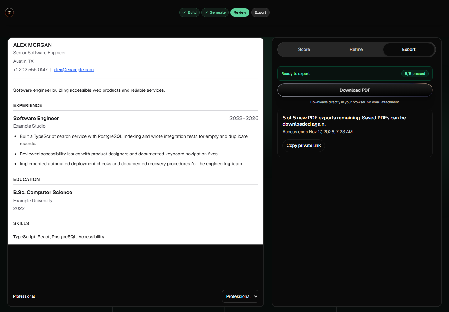
The Export tab brings the PDF action and access information together, so the person can finish the draft they unlocked.

The success screen follows a real local PDF export. Email delivery remains a separate, unconfirmed status, with ways to keep the file or recovery link.
The work connected explanation, input, AI checks, payment, and recovery. Building the frontend and backend made me responsible for how those promises held together.
Can people explain the feedback and act on it? I would track builder completion, useful refinements, successful exports, and whether preview and pricing help people make an informed purchase.
First test whether people finish with a resume they trust. Then compare improvements to guidance and the offer against paid unlocks, repeat applications, and support requests.
Homepage writing and assessment examples are illustrative. The capture set does not demonstrate live model quality, provider checkout, hosted email delivery, better hiring outcomes, or conversion gains.